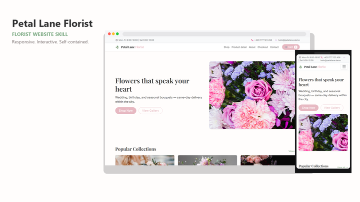
Web Design Petal Lane Florist
By Sam Rivera
Web Design Petal Lane Florist draft pack.
CartClaude · Cursor · Codex
$4.99471 downloads
One composition across every screen
Start with a responsive web design template your coding agent can reuse. Pick a Skillux pack with a clear page structure, inspect the preview across breakpoints, and brief the agent with your real content and stack.
Last updated 2026-11-07
From the live Skillux catalog
231 matching skills. Check each listing for its contents and license.
By Sam Rivera
Web Design Petal Lane Florist draft pack.
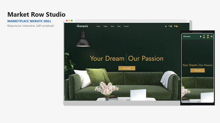
By Sam Rivera
Web Design Market Row Studio draft pack.
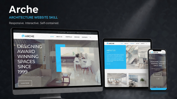
By Jordan Blake
Web Design Arche draft pack.
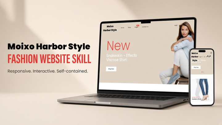
By Sam Rivera
Web Design Moixo Harbor Style draft pack.

By Maya Ellis
Web Design Skylink website-generation skill pack.
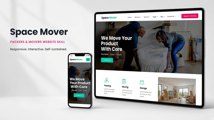
By Sam Rivera
Web Design Spacemover draft pack.
Put the skill to work
Open the pack preview and imagine the same composition on a phone, tablet, and laptop. Prefer templates where hierarchy, spacing, and the primary action stay clear when the layout reflows.
Compare the actual file list with your project: a static HTML starter, framework components, and design instructions require different integration work. Confirm the supported agent and stack before installing. Treat a preview contact form, booking control, or checkout as a visual example until you have verified its backend behavior.
Tell your agent which content must stay visible on a narrow screen: headline, CTA, navigation, pricing, or forms. Ask it to avoid stacking that hides the main action below long copy.
Check wrapped labels, sticky headers, form errors, and focus states on a small viewport. A responsive web design template is useful only when those states remain usable after generation.
Browse the matching packs below. Use each preview and description to judge page structure, mobile behavior, and whether the included files fit your project.
Confirm Claude, Cursor, Codex, or another supported agent on the listing. Follow the installation guide so the template instructions stay available in the working project.
Name the installed skill, provide your content and stack, and ask for a responsive implementation. Review the result at phone, tablet, and desktop widths before shipping.
On Skillux, a responsive web design template is usually delivered as a skill pack: instructions, optional starter HTML or code, and design guidance your AI coding agent can apply. Open each listing to see what is included.
Many packs include a static starter or example site for preview, but the product is a reusable skill for an AI agent. Check the detail page for files, license terms, and supported tools before installing.
Check the supported tools on the individual listing. For a compatible pack, install its instructions and assets, describe your framework and required pages, and ask the agent to adapt the starter to your content. Review the generated implementation at multiple widths before publishing.
Choose a pack whose preview looks coherent on a narrow screen, then state breakpoint requirements in your brief. Ask the agent to verify navigation, typography, and the primary CTA at common widths.